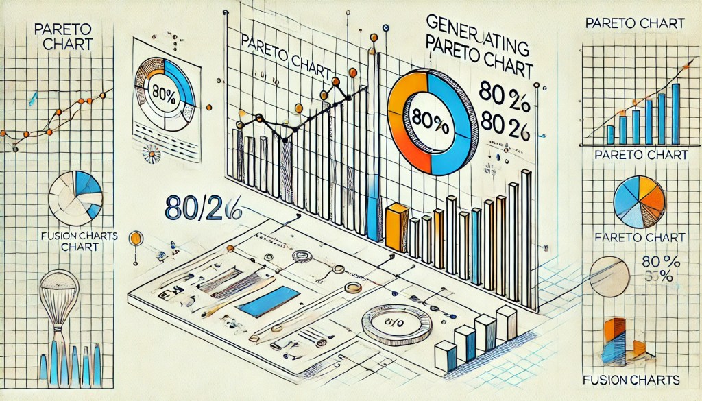
As soon as I read about Pareto Charts on FusionCharts blog and how it uses cumulative percentage on a dual-y axes graph to allow users to summarize data into segments, I realized that a simple script to generate the FusionCharts XML would help users generate such graphs.
For those who do not know what is FusionCharts, it is simply something that can convert your boring tables of data into sexy animated charts.
We have a simple linear column of data. And we need to generate the last column, which is the cumulative percentage of the entire series of data.
| Label | Existing Data | Generated Column |
|---|---|---|
| Item 1 | 400000 | 40% |
| Item 2 | 250000 | 25% |
| Item 3 | 150000 | 15% |
| Item 4 | 100000 | 10% |
| Item 5 | 50000 | 5% |
| Item 6 | 50000 | 5% |
| Summation | 1000000 | 100% |
If you have your data, convert it to CSV and use this script to generate the XML to render FusionCharts Dual Y-Axis Combination Chart.
JavaScript to Generate Pareto Chart for FusionCharts
function generateFusionChartsParetoXML (SourceCSV) {
     var i, s=0,
         x = "",
         d = SourceCSV.value.match(/[^\r\n,]+/ig);

     x += "\n";

     for (i = 0; i < d.length; i+=2) {
         x += "\n   ";
     }
     x += "\n\n";
     for (i = 1; i < d.length; i+=2) {
         d[i] = parseFloat(d[i]);
         x += "\n   ";
         s += d[i]; // do summation
     }
     x += "\n\n";
     for (i = 1; i < d.length; i +=2) {
         x += "\n   ";
     }
     x += "\n\n";
     return x;
 };
Hope this had been useful.


Leave a comment